Tutorial
1. Select a data set of your interest.

There are four datasets available in this data portal, as highlighted in the top right corner of the figure above.
1) cis-sQTL: cis-sQTL summary statistics for 12,794 sGenes pooled from THISTLE and LeafCutter cis-sQTL analyses in 2,865 brain cortex samples. About 11.6 million SNPs with MAF > 0.01 are available.
2) trans-sQTL: trans-sQTL summary statistics for 223 trans-sGenes pooled from THISTLE and LeafCutter trans-sQTL analyses in 2,865 brain cortex samples. About 9.1 million SNPs with MAF > 0.01 are available.
3) cis-eQTL: cis-eQTL summary statistics for 16,704 eGenes from cis-eQTL analysis in 2,865 brain cortex samples. About 11.6 million SNPs with MAF > 0.01 are available.
4) trans-eQTL: trans-eQTL summary statistics for 230 trans-eGenes from trans-eQTL analysis in 2,865 brain cortex samples. About 9.1 million SNPs with MAF > 0.01 are available.
2. Select or search for a gene of your interest.
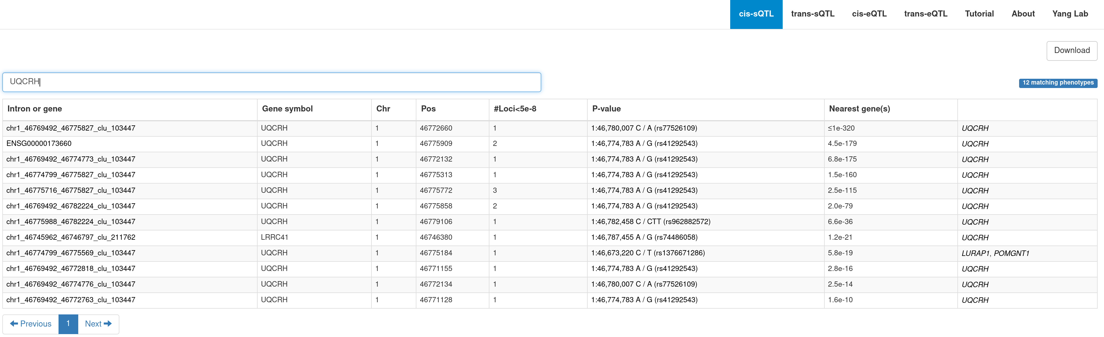
3. Query results
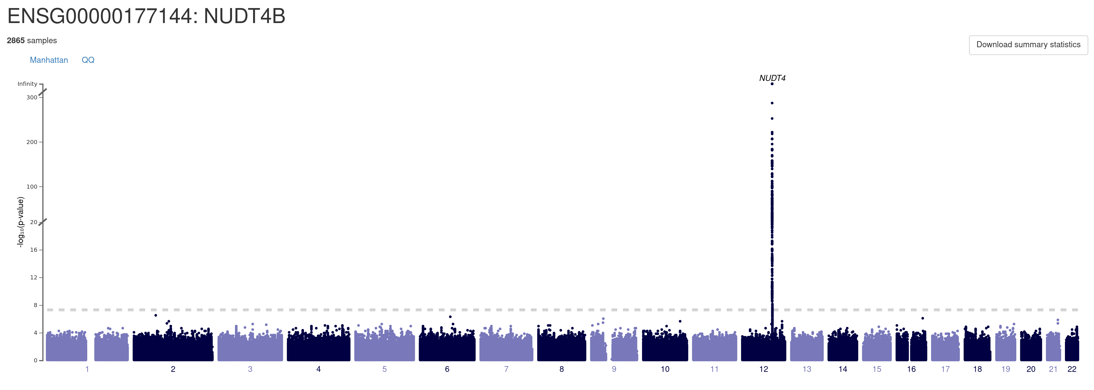
A. Manhattan plot. You can explore details of each association signal by moving mouse cursor to the locus of interest. You can navigate to a regional association plot (see below) by clicking on the locus. You can also download the full summary data for this gene by clicking on the link "Download summary statistics".
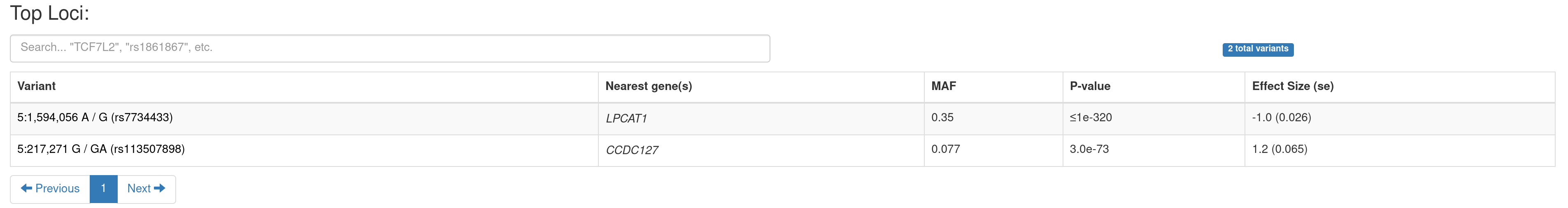
B. A summary table of the genome-wide significant loci. You can navigate to a PheWAS plot (see below) by clicking on a variant.
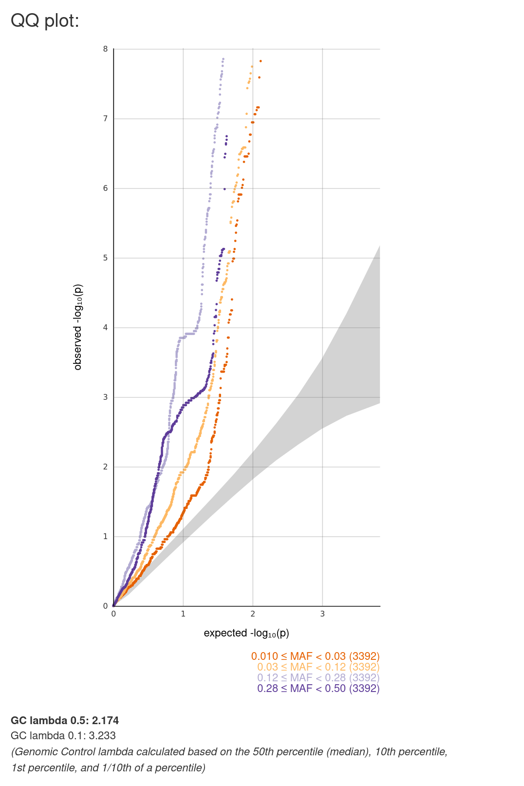
C. Quantile-Quantile plot (QQ plot). It plots the observed -log10(p-values) of a group of variants against the corresponding values expected under the null model of no association. All the available variants are stratified into three groups by minor allele frequency (MAF).
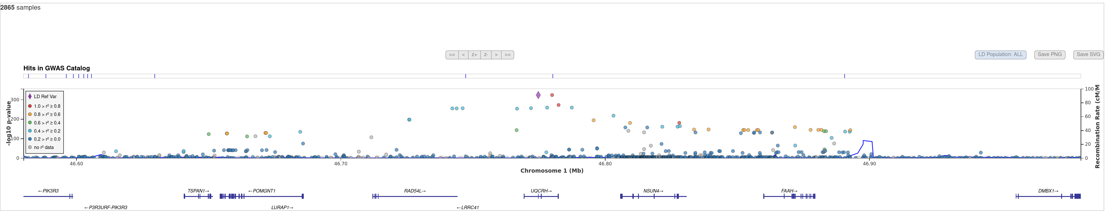
D. Regional association plot. It plots -log10(p-values) of variants in a genomic region of interest, with the top associated variant highlighted by a triangle. This plot is designed to facilitate viewing regional association results together with useful information such as the physical locations and orientations of the genes (on the track underneath the association plot), linkage disequilibrium between the top associated variant and any other variant (indicated by the colour of a dot) and local estimates of recombination rates (represented by the blue solid line). See https://genome.sph.umich.edu/wiki/LocusZoom for more details.
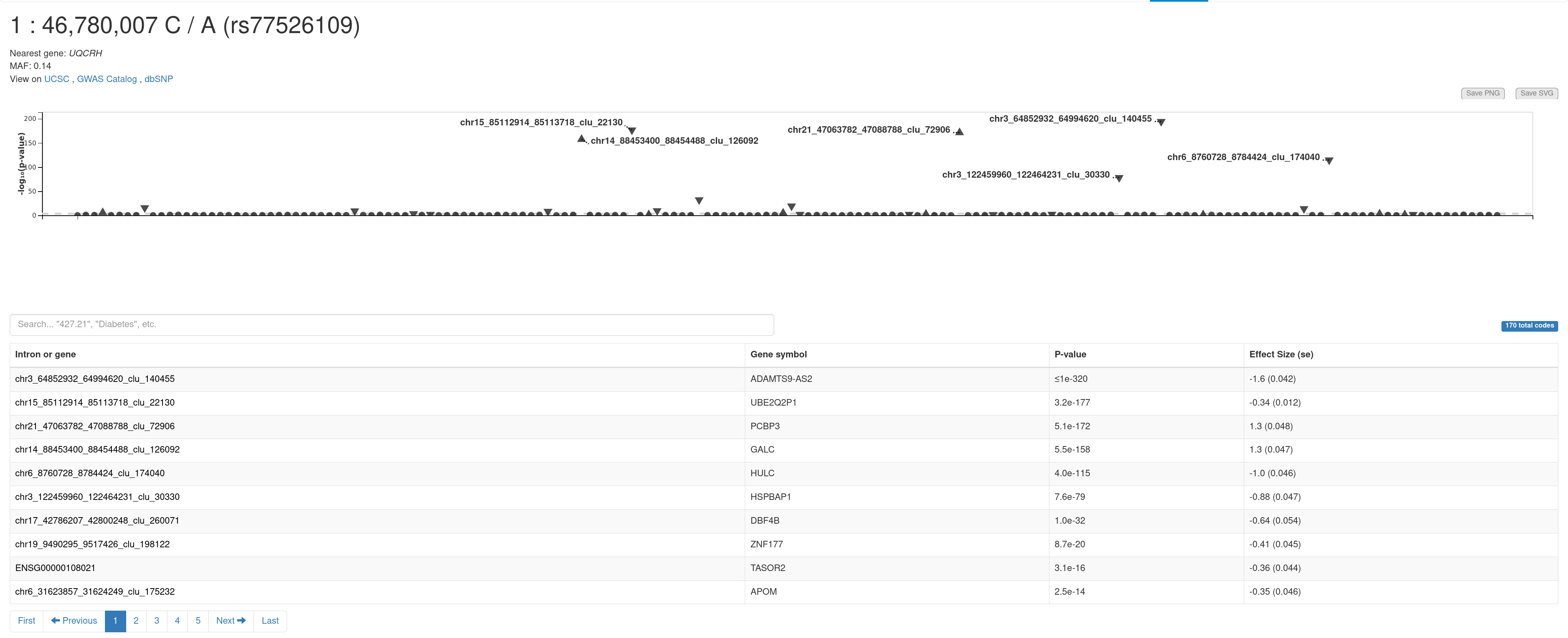
E. PheWAS plot. It shows the associations of a variant of interest with all the genes available in this database. You can view the summary information (e.g., gene, sample size, and p-value) of an association by moving the mouse cursor to a triangle. Summary statistics for all the traits are presented in the table below.
Note: we do not provide a Manhattan plot for cis-sQTLs/eQTLs.